Form Control Types Documentation
This Documentation describes various Form Control Types with detailed examples of their structure and usage in JSON format. These can be used for building forms dynamically with different controls, depending on the input needed.
1. BOOLEAN_FIELD
1.1 Description
A control used to represent a boolean value (true/false).
1.2 Use Case
Use this control for toggling features, such as enabling or disabling a schedule.
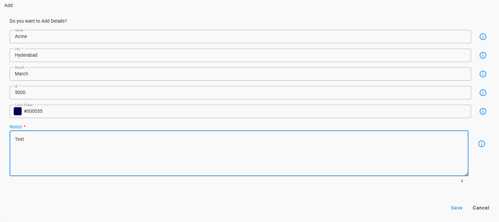
{
  "fieldId": "expired",
  "label": "Expired",
  "description": "Please confirm the expiration status",
  "required": false,
  "default": true,
  "dataType": "boolean",
  "hidden": false,
  "editable": true,
  "controlType": "BOOLEAN_FIELD"
}

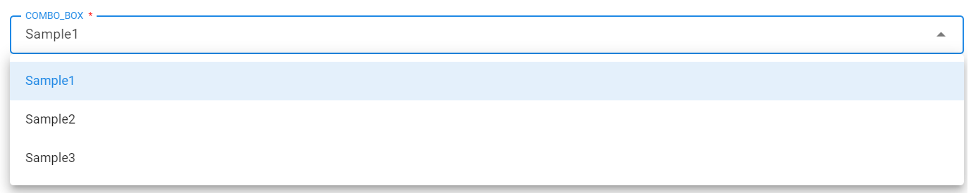
2. COMBO_BOX
2.1 Description
A dropdown control allowing users to select from predefined options or values fetched from a stream.
2.2 Use Case
Use this control to display a list of options, either inline or dynamically loaded via pstream/dataset.
Note
lovSourceType:
- Accepted values:
inline(default) orpstream/dataset.
lovSourceParams:
-
Required if lovSourceType is not inline.
-
name: Name of the pstream/dataset - Required.
-
valueColumn: Column which contains the lov identifier - Required.
-
labelColumn: Column which contains the lov displayName - Optional.
-
query: cfxql query to filter the pstream/dataset - Optional.
-
max_rows: Maximum number of values to retrieve. (Default is 100) - Optional.
lovValues:
-
Values given in
lovValueswill be appended to the results coming from the pstream/dataset above. -
If the same identifier is found in both
pstream/datasetandlovValues, the identifier given inlovValuestakes precedence.
{
  "help": "Status",
  "dataType": "string",
  "controlType": "COMBO_BOX",
  "required": true,
  "editable": true,
  "label": "Status",
  "hidden": false,
  "fieldId": "city",
  "lovSourceType": "pstream",
  "lovSourceParams": {
    "name": "main",
    "valueColumn": "city",
    "labelColumn": "city",
    "query": "city contains 'hyderabad'"
  },
  "lovValues": [
    {
      "identifier": "sample1",
      "displayName": "Sample1"
    },
    {
      "identifier": "Sample2",
      "displayName": "Sample2"
    },
    {
      "identifier": "Sample3",
      "displayName": "Sample3"
    }
  ]
}
3. RADIO_BUTTON
3.1 Description
A set of radio buttons for single selection among predefined options.
3.2 Use Case
Useful when the user needs to select one option from a small list of predefined choices.
{
  "fieldId": "inputFieldId",
  "label": "Input Field",
  "help": "Input Field",
  "dataType": "string",
  "hidden": false,
  "editable": true,
  "required": true,
  "lovValues": [
    {
      "identifier": "device1",
      "displayName": "Device 1"
    },
    {
      "identifier": "device2",
      "displayName": "Device 2"
    },
    {
      "identifier": "device3",
      "displayName": "Device 3"
    }
  ],
  "controlType": "RADIO_BUTTON"
}

4. TEXT_FIELD
4.1 Description
A simple text input field.
4.2 Use Case
Used when textual information needs to be input, such as IP addresses or user information.
{
  "fieldId": "ip_address",
  "label": "Please Add the device IP",
  "help": "Please Add the device IP",
  "dataType": "string",
  "controlType": "TEXT_FIELD",
  "hidden": false,
  "editable": true,
  "required": false
}

{
  "fieldId": "newPassword",
  "label": "New Password",
  "help": "New Password of User",
  "dataType": "string",
  "controlType": "TEXT_FIELD",
  "controlPropertyList": [
    {
      "attribute": "input-type",
      "value": "password"
    },
    {
      "attribute": "layout-group-id",
      "value": "newPassword"
    },
    {
      "attribute": "layout-percent",
      "value": "100"
    }
  ],
  "hidden": false,
  "editable": true,
  "required": true
}

{
  "fieldId": "device_ip",
  "label": "Please Add the device IP if not below",
  "help": "Please Add the device IP if not below",
  "dataType": "string",
  "controlType": "TEXT_FIELD",
  "defaultValue": "10.11.123.123",
  "hidden": false,
  "editable": true,
  "required": false
}

4.3 Trim User Input
The trimUserInput control property allows trimming of leading and trailing whitespace from the input value in a TEXT_FIELD. When set to true, the UI will automatically trim the user’s input before sending it in the form data. This helps avoid issues with accidental spaces in fields like usernames, passwords, or codes. By default, trimming is not enabled, allowing the user’s input to be sent exactly as entered.
Usage
Add the following control property to your field definition
{
"fieldId": "name",
"label": "Name",
"help": "Name of User",
"dataType": "string",
"controlType": "TEXT_FIELD",
"controlPropertyList": [
{
  "attribute": "trimUserInput",
  "value": true
}
],
"hidden": false,
"editable": true,
"required": true
}
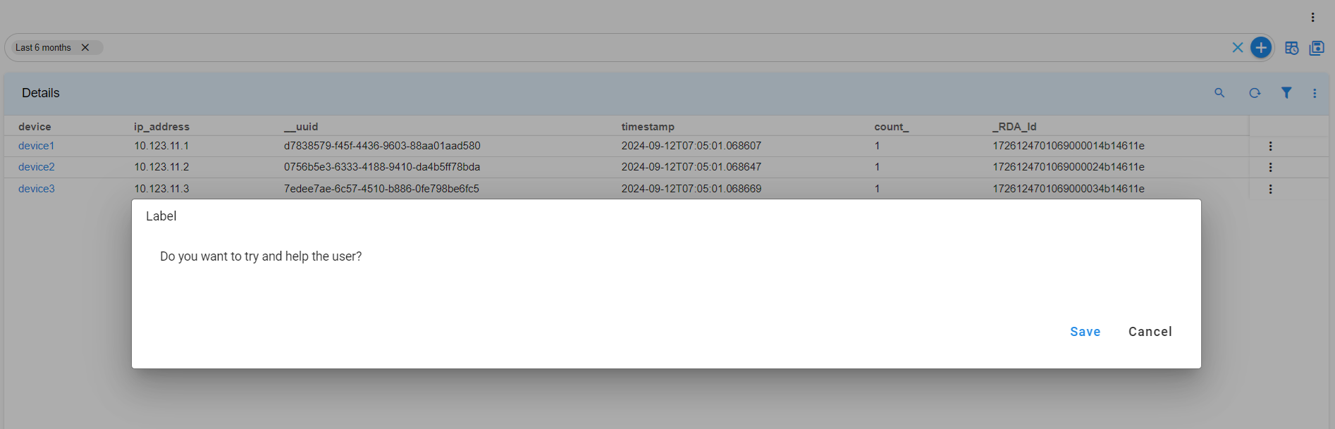
5. LABEL
5.1 Description
le label for displaying static information.
5.2 Use Case
Use this when you need to display static information to users without requiring input.
{
  "help": "Do you want to try and help the user",
  "dataType": "string",
  "controlType": "LABEL",
  "required": false,
  "editable": false,
  "label": "Do you want to try and help the user",
  "hidden": false,
  "fieldId": "monitor"
}
6. FILE_UPLOAD
6.1 Description
A control used to upload files.
6.2 Use Case
Use this control when users need to upload files to the system.
{
  "help": "Choose file to upload",
  "dataType": "string",
  "required": true,
  "editable": true,
  "label": "Choose file to upload",
  "controlType": "FILE_UPLOAD",
  "hidden": false,
  "fieldId": "fileUpload"
}

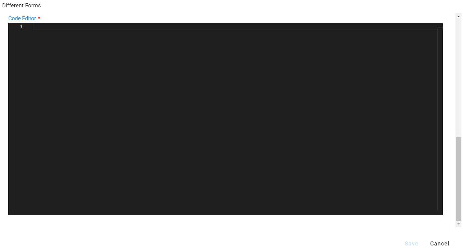
7. PYTHON_EDITOR
7.1 Description
A code editor for writing Python or other programming languages.
7.2 Use Case
Use this control for inputting rules, scripts, or configuration files.
{
  "fieldId": "pythonFieldId",
  "label": "Code Editor",
  "description": "Code Editor",
  "required": true,
  "isSecret": false,
  "dataType": "string",
  "hidden": false,
  "editable": true,
  "controlType": "PYTHON_EDITOR",
  "controlPropertyList": [
    {
      "attribute": "lang",
      "value": "json"
    }
  ]
}
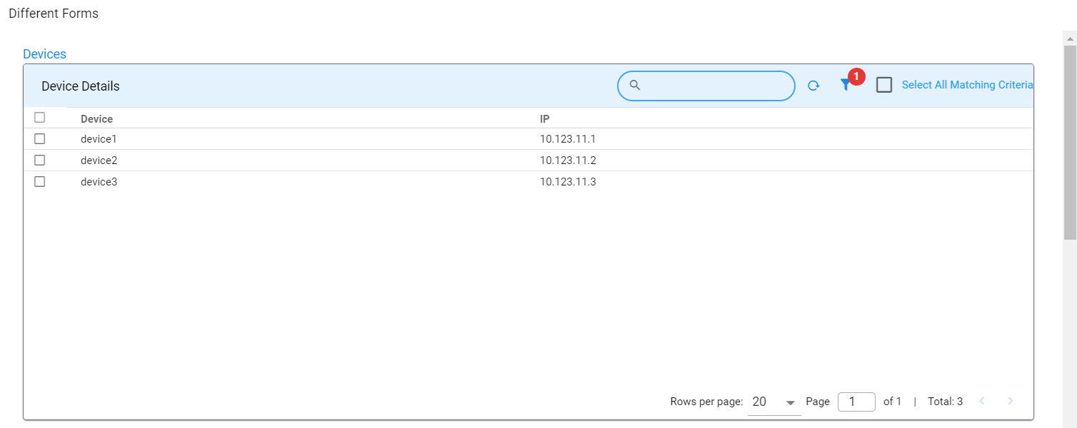
8. SELECTOR_TABLE
8.1 Description
A control displaying a table, allowing users to select one or more rows.
8.2 Use Case
Useful for selecting records from a list of options shown in a table format.
{
  "help": "Devices",
  "dataType": "string",
  "required": false,
  "editable": true,
  "label": "Devices",
  "hidden": false,
  "fieldId": "Others",
  "controlType": "SELECTOR_TABLE",
  "controlPropertyList": [
    {
      "attribute": "column-key",
      "value": "device"
    },
    {
      "attribute": "selection",
      "value": "MULTIPLE"
    }
  ],
  "widget": {
    "title": "Device Details",
    "timebased": false,
    "max_width": 12,
    "height": 8,
    "min_width": 12,
    "extra_filter": "deviceSupports contains 'ipV4'",
    "stream": "device",
    "ts_column": "timestamp",
    "sorting": [],
    "columns": {
      "device": {
        "title": "Device",
        "key": true
      },
      "ip_address": {
        "title": "IP"
      }
    }
  }
}
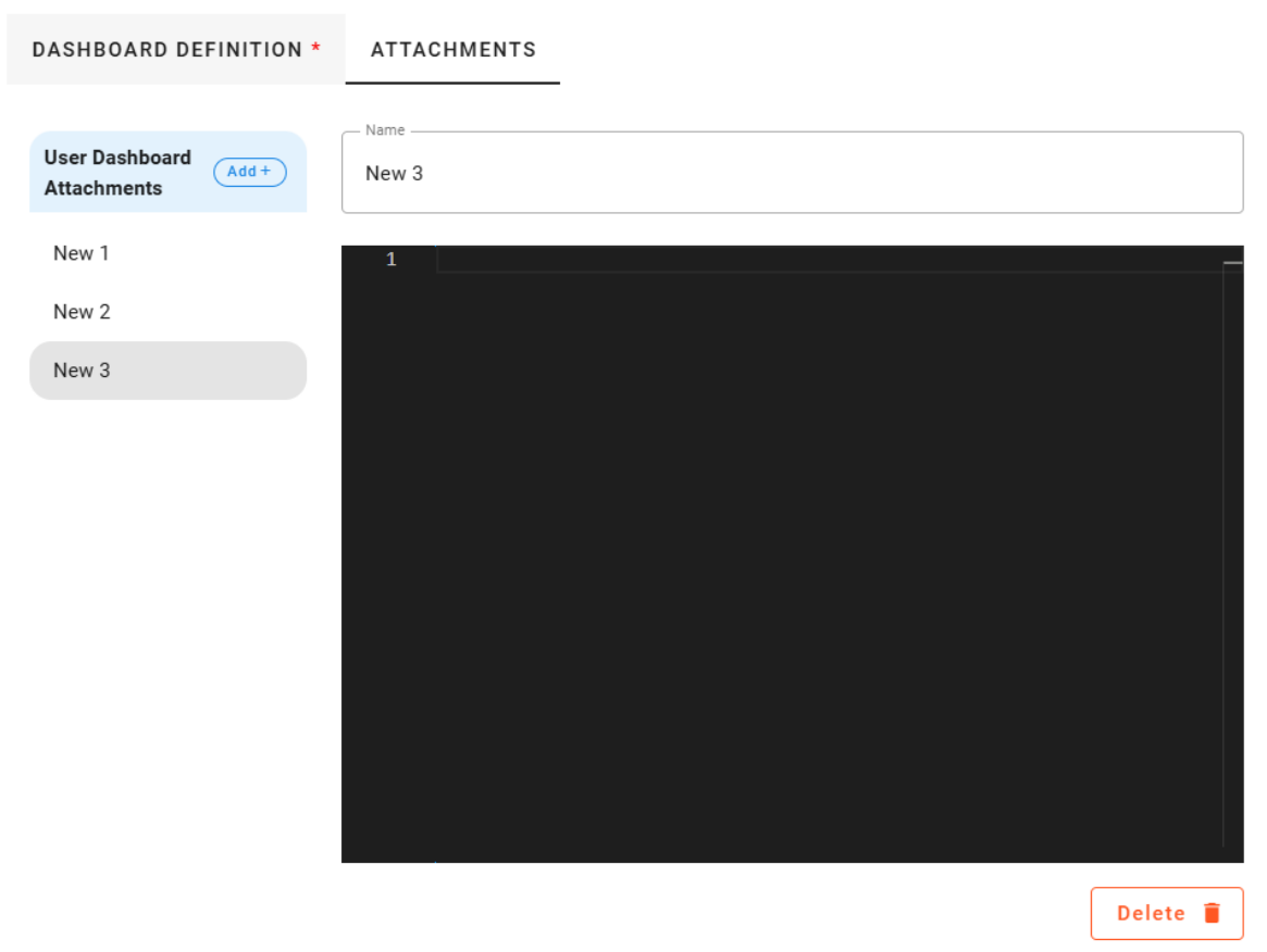
9. JSON_PROP_FIELD
9.1 Description
The JSON_PROP_FIELD control is used to create or edit JSON properties, especially useful when handling long text strings like HTML templates. This control allows users to input structured data in JSON format, making it ideal for scenarios where properties need to be flexible and editable in a key-value format.
9.2 Use Case
This control type is particularly helpful when dealing with complex data structures or properties that involve large text blocks, such as configurations, templates, or settings that are represented in JSON. For instance, it can be used to manage HTML templates or other text-heavy content in a structured format.
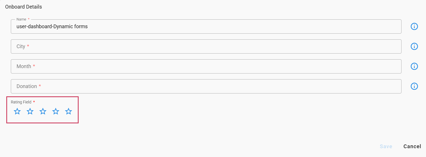
New properties in the JSON field now use a dynamic prefix based on the new-property-label-prefix control property. For example, if new-property-label-prefix is set to "Attachment," the labels will be "Attachment 1", "Attachment 2" etc. If no value is provided for new-property-label-prefix, the labels will default to "New 1", "New 2", etc. As shown in the example screenshot below
{
  "fieldId": "json_test",
  "label": "User Dashboard Attachments",
  "description": "User Dashboard Attachments",
  "required": true,
  "isSecret": false,
  "dataType": "string",
  "hidden": false,
  "editable": true,
  "controlType": "JSON_PROP_FIELD",
  "controlPropertyList": [
    {
      "attribute": "layout-field-group-title",
      "value": "Testing Editor"
    }
  ]
}
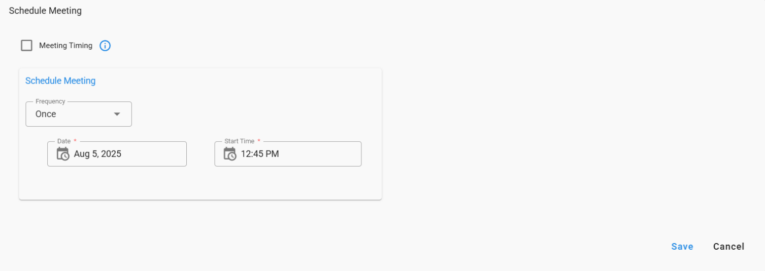
10. DATETIME_SCHEDULER_FIELD
10.1 Description
This field allows users to schedule tasks with selectable frequency (Once, Hourly, Daily).
10.2 Use Case
Enable users to configure automated task schedules with selectable frequency.
{
"fieldId": "schedule",
"label": "Schedule Meeting",
"help": "Schedule",
"dataType": "string",
"controlType": "DATETIME_SCHEDULER_FIELD",
"controlPropertyList": [
{
"attribute": "frequencyOptions",
"value": [
            "Once",
           "Hourly",
           "Daily"
             ]
},
{
"attribute": "buildCronExpression",
"value": true
},
{
"attribute": "layout-group-id",
"value": "usertype-role1"
},
{
"attribute": "layout-percent",
"value": "50"
}
],
"hidden": false,
"editable": true,
"required": false
}
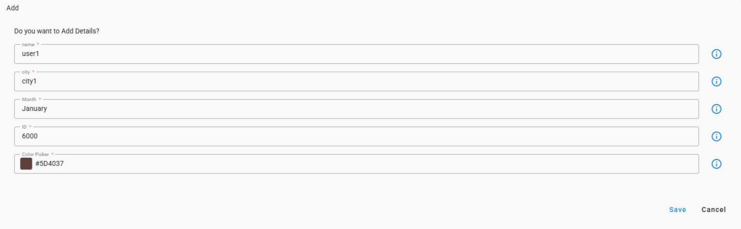
11. COLOR_PICKER
11.1 Description
Provides users with a color picker input to select and choose colors easily.
11.2 Use Case
Permits users to customize and personalize UI elements by selecting their preferred colors.
{
"controlType": "COLOR_PICKER",
"editable": true,
"fieldId": "CP",
"help": "Color Picker",
"hidden": false,
"label": "Color Picker",
"required": true
}
12. TEXT_AREA
12.1 Description
Offers a multi-line text input for users to enter detailed information, comments.
12.2 Use Case
Allows users to provide notes, observations, or additional context for forms, reports, or tasks.
{
"fieldId": "notes",
"label": "Notes",
"help": "Notes",
"dataType": "string",
"controlType": "TEXT_AREA",
"hidden": false,
"editable": true,
"required": true
}
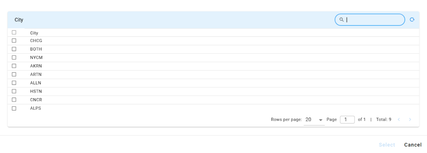
13. SELECTOR_DIALOG
13.1 Description
Allows users to select multiple values from a dynamic list through a selector dialog interface.
13.2 Use Case
Enables users to choose relevant device metrics for example tracking, reporting, or alert configuration.
{
  "fieldId": "city",
  "label": "city",
  "help": "city",
  "key_attribute": true,
  "controlType": "SELECTOR_DIALOG",
  "selectionType": "MULTIPLE",
  "pstream": "mobility_kpi_metrics_data",
  "query_attributes": [
        "network_type",
        "region",
        "city"
  ],
 "server-validation": {
 "clear_attributes": [
        "clli_code",
        "device",
       "vpnname",
       "vpnid",
       "apn"
 ],
 "read_attributes": [
        "clli_code",
        "device",
        "vpnname",
        "vpnid",
        "apn"
 ]
 }
 }
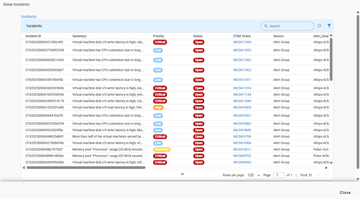
14. READ_ONLY_TABLE
14.1 Description
Displays a large, read-only table listing data entries.
14.2 Use Case
Allows users to view and reference a filtered list of records without the ability to edit the information.
{
"dataType": "string",
"controlType": "READ_ONLY_TABLE",
"widget": {
"extends": "incidents:incident_tabular",
"extend_vars": {
"incidents_tabular_extra_filter": "$cfxqlFilter"
},
"timebased": false
},
"required": false,
"editable": false,
"label": "Incidents",
"hidden": false,
"controlPropertyList": [
{
"attribute": "table-size",
"value": "large"
}
],
"fieldId": "selectedIncidents"
}
15. RATING_FIELD
15.1 Description
Rating field allows the user to choose a score on a defined range.
15.2 Use Case
Used when a quick satisfaction or quality score is needed, such as post-event feedback or ticket-resolution rating.
{
  "controlType": "RATING_FIELD",
  "editable": true,
  "fieldId": "ratingField",
  "help": "Rating Field",
  "hidden": false,
  "label": "Rating Field (required)",
  "required": true
}
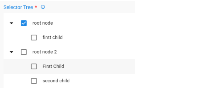
16. TREE_SELECTOR
16.1 Description
A tree-style list that features checkboxes next to each item, enabling users to select one or more items from various hierarchical levels.
16.2 Use Case
Ideal for scenarios where users must select items from a multi-tiered structure, such as categories, folders, or grouped datasets retrieved through an API endpoint.
{
    "controlType": "TREE_SELECTOR",
    "editable": true,
    "fieldId": "treeSelector",
    "help": "Description of field",
    "hidden": false,
    "label": "Selector Tree",
    "required": true,
    "controlPropertyList": [
        {
            "attribute": "api-endpoint",
            "value": {
                "methodName": "invokeAppApi:getTreeData",
                "namespace": "io.cfx.dimensions.app",
                "params": [
                    {
                    "context": {},
                    "filters": []
                    }
                ],
                "parse-output": false,
                "service-name": "cfx-ui-mock-data",
                "stringified-params": true,
                "version": "*"
            }
        }
    ]
}
16.3 Configuration
The component can be configured via the following controlProperties in the controlPropertyList
16.3.1 selection-mode
This feature accepts two values independent (default) and leaf. When the independent value is selected, it permits the selection of the root node. However, if the leaf value is chosen, the selection of the root node is restricted.
16.3.2 selection
This feature enables configuration for either single or multi-selection options, Takes SINGLE(default) and MULTIPLE as values
17. HTML_FIELD
17.1 Description
A field designed for displaying and rendering HTML content.
17.2 Use Case
Utilize this when you need to present formatted text, hyperlinks, or other HTML content.
{
  "controlType": "HTML_FIELD",
  "editable": true,
  "fieldId": "htmlField",
  "help": "Description of field",
  "hidden": false
}

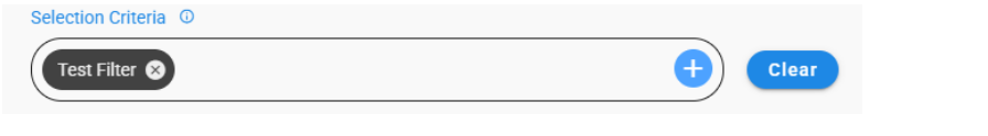
18. FILTER_FIELD
18.1 Description
A field utilized to filter data according to a specified list of values or attributes.
18.2 Use Case
Use this feature when you want to refine results by selecting one or more predefined values.
{
  "fieldId": "selectioncriteria",
  "label": "Selection Criteria",
  "help": "Selection Criteria",
  "dataType": "json",
  "controlType": "FILTER_FIELD",
  "hidden": false,
  "editable": true,
  "required": false,
  "lovValues": [
      {
          "identifier": "sourcemechanism",
          "displayName": "Source Mechanism",
          "type": "TEXT"
      },
      {
          "identifier": "sourcesystemname",
          "displayName": "Source",
          "type": "TEXT"
      },
      {
          "identifier": "severitylabel",
          "displayName": "Severity",
          "type": "TEXT"
      }
  ]
}
{
    "controlType": "FILTER_FIELD",
    "editable": true,
    "fieldId": "filterField_with_api_end_point,
    "help": "Filter field with api endpoint ",
    "hidden": false,
    "label": "Filter Field with api end point",
    "required": false,
    "controlPropertyList": [

        {
            "attribute":"api-endpoint",
            "value": {
                "methodName": "getFilterFieldLovs",
                "namespace": "io.cfx.dimensions.app",
                "params": [
                    {
                        "context": {},
                        "filters": [],
                        "params": {},
                        "url": ""
                    }
                ],
                "parse-output": false,
                "service-name": "saas-reports",
                "version": "*"
            }
        }
    ]

}
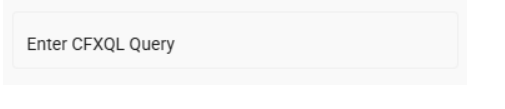
19. QUERY_FIELD
18.1 Description
A field that accepts a CFXQL query, enabling advanced and accurate data filtering.
18.2 Use Case
Use this feature when you require flexible, custom, or complex filter conditions that standard filters cannot accommodate.
{
  "fieldId": "filter",
  "label": "Enter CFXQL Query",
  "help": "Enter CFXQL Query",
  "controlType": "QUERY_FIELD",
  "hidden": false,
  "editable": true,
  "required": false
}
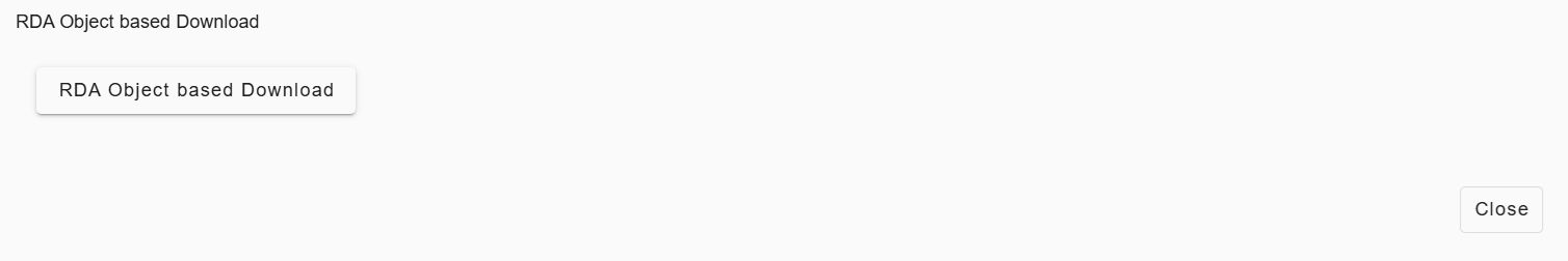
20. DOWNLOAD_BUTTON
20.1 RDA Object Based
20.1.1 Description
A download button that retrieves files from RDA objects using the specified folder and object name.
20.1.2 Use Case
Use this feature when users need to download files stored in RDA objects.
{
  "dataType": "string",
  "required": false,
  "editable": false,
  "hidden": false,
  "label": "Download Documentation",
  "folder": "default",
  "objectName": "download_button.md",
  "controlType": "DOWNLOAD_BUTTON",
  "fieldId": "csv_download_template"
}
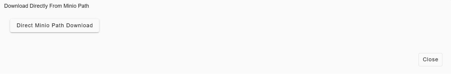
20.2 Direct Minio Path
20.2.1 Description
A download button that facilitates file download using a direct Minio path specified in the control configuration.
20.2.2 Use Case
Use this feature when the file path is known in advance and users need to download a specific output such as reports, logs, or generated artifacts.
{
  "dataType": "string",
  "required": false,
  "editable": false,
  "hidden": false,
  "label": "Download Report",
  "controlType": "DOWNLOAD_BUTTON",
  "fieldId": "report_download",
  "output_minio_path": "reports/2026/january/report_12345.pdf"
}
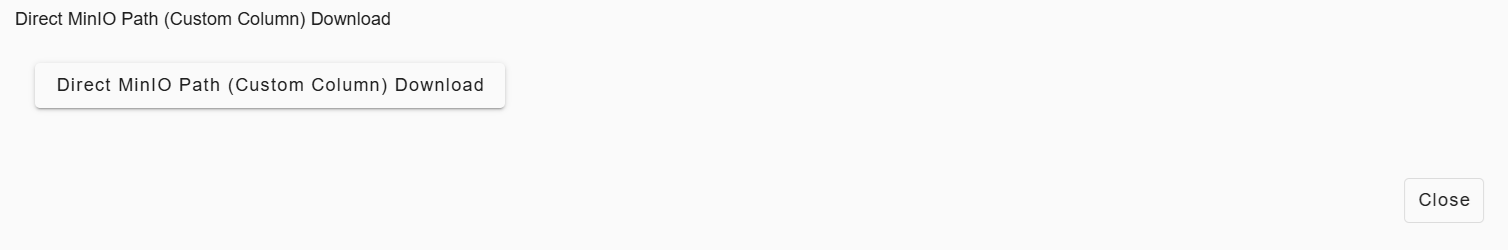
20.3 Direct Minio Path (custom_path)
20.3.1 Description
A download button that dynamically resolves the Minio file path using a custom column value.
20.3.2 Use Case
Use this feature when each row or record has a different file to download, such as per-device reports, or record-specific artifacts.
{
  "dataType": "string",
  "required": false,
  "editable": false,
  "hidden": false,
  "label": "Download Report From Direct Minio Path – Custom Column",
  "controlType": "DOWNLOAD_BUTTON",
  "fieldId": "report_download_details",
  "minio_path_column": "custom_path",
  "custom_path": "reports/2026/january/report_123.pdf"
}
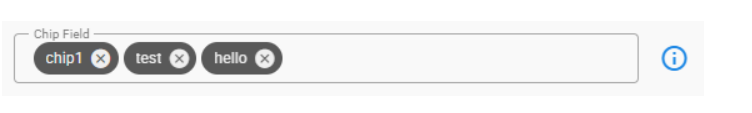
21. CHIP_FIELD
21.1 Description
An input field that transforms each entered value into a chip upon pressing Enter, enabling users to add multiple chips consecutively.
21.2 Use Case
Use this feature when you need to enter multiple short inputs, such as tags, keywords, or identifiers for an item.
{
    "controlType": "CHIP_FIELD",
    "editable": true,
    "fieldId": "chipField",
    "help": "Description of field",
    "hidden": false,
    "label": "Chip Field",
    "required": false,
    "controlPropertyList": [
        {
            "attribute": "layout-field-group-title",
            "value": "Selector Type Field 1"
        }
    ]
},
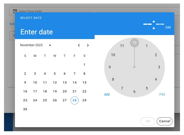
22. DATE_TIME_FIELD
22.1 Description
A field designed to capture both date and time within a single input.
22.2 Use Case
Use this feature when you need to provide a complete timestamp instead of just a date or a time.
{
  "controlType": "DATE_TIME_FIELD",
  "editable": true,
  "fieldId": "datetimeField",
  "help": "Description of field",
  "hidden": false,
  "label": "Date/Time Field",
  "required": false
},